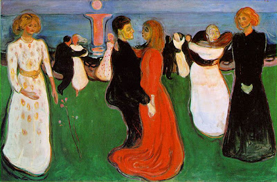
Monday, October 26, 2009

My Bug


This is a Picture of my collage bug! He is a very colorfull mix of a catepiller and a worm. He is chillin the grass enjoying the sunshine, something we don't get enough time to do in Aberdeen!

http://nsuartmethodsmaxart.northern.edu/

Sunday, October 25, 2009

Larry Chatman

1. Larry Chatman’s exhibit was pretty impressive. I was impressed with the :”power” of his pictures and the way they grabbed you without using any images of people. I thought for sure to get the point of the devestation and destruction in the 9th ward he would have had to capture people around the rubble, maybe sifting through trying to find there belongings. That is why I was so impressed with his photography is because it made you feel pain without even seeing it on other people’s faces. That is why I do agree with almost everything that Mr. Chatman had said though out his presentation, I was thoughouly impressed.

2. The big thing I would take from his presentation and put into my own work is his passion. Everyone in the room could tell that he was real passionate about all of his pictures and you could tell that he really cared for the people who’s lives where dramaticly changed. I want to be able to take that passion for children learning into my classroom everyday.

3. Guest artists are great for young children. It gives them an opportunity to learn from and experience a most of the time a pretty accomplished artist. It also gives them a chance to learn new aspects of art that maybe there own art teacher hasn’t taught them. I think that whenever students can go on field trips and learn outside of the classroom it is important because you can always “trick” them into learning. I say that because they will be having fun and when kids are having fun they don’t even realize that they are learning valuble lessons. By: Max Foth

Monday, October 5, 2009

Shape and Movement

(This is my shape and movement project that I worked on in class. The first thing I would like to say about it is that is hard to see but on my "blobs" on the top there are two more of them that you might have trouble seeing because they were done with pink colored pencil, I used pink because I thought the color would "pop" off the page, obviously I was wrong!)

My shape and movement project is very simple in its design. It is simple because I didn't want it to be lost in confusion about what my goal of the project would be. I used two different kinds of shapes when I created this piece- Original and Organic. The original shapes would obviously be the squares that are going across the bottom of the paper. I went from small shapes on the left to larger shapes on the right in an attempt to "move" the readers eyes across the page, then using the organic shapes above I did just the opposite and I started with the little shapes on the right and went to bigger shapes on the left to pull the readers eyes back across the page. I feel that with this simple set up it would help elementary education students to better understand the different kinds of shapes, and how movement works. This may not be the most stunning piece of art ever done but I feel it gets the job done when trying to show students the basics of movement and shape.

My Footprint


My footprint describes me and a few different ways. I like the fact that I used green as my color of my foot because it is one of my favorite colors. The number 33 is on my foot because that is my little brothers basketball number and going back home to watch him play is always a really fun time for me. Right underneath that is an "attempt" to draw a piano. I have this on my foot because of all the years that I played piano early in my childhood. To the right of the piano is my favorite team in all of sports, The San Francisco 49ers. I have loved this NFL team as far back as I could remember that's why I thought they were very deserving to be on my foot! Then last but not least is a drawing of a couple of cards and some nice dice placed on my foot. This of course represents my love for gambling and having fun with friends. There aren't many things better then having a few friends over to play some cards!
Edvard Munch- "The Dance of Life" 1899-1900

Description- The painting uses mostly calm colors, aside from the giant pink I and the bright orange dress. The human shapes seem to be very curvy and there isn't much use of any jagged line. The piece seems really smooth.

The Design- It seems like with the use of the cool colors the piece starts out very happy on the left side of the painting. The white dress really emphasizes that. Then once you look across the painting it kind of gives a feeling of a timeline and what happens durning life and how chaotic it can be. Then finally at the far right side of the painting it gets really somber and sad with the black dress empahsizing that.

The Meaning- I think that this painting signifies that the begining and end of life with everything inbetween.

Judgement- This painting shows two completely contrasting views of the begining and the end of life. It seems like it is saying life is some sort of dance, it may go on for awhile but sooner or later the song will end.